4 Weeks Free Access (cancel anytime)
Interactive GuideComparisonWellnessBody pain

Best Body Pain Mapping Tools for S&C Coaches (2026)

Seven athlete monitoring tools compared on how they record where it hurts: anatomical map, side, tissue type, intensity scale, squad view and injury history.

Published
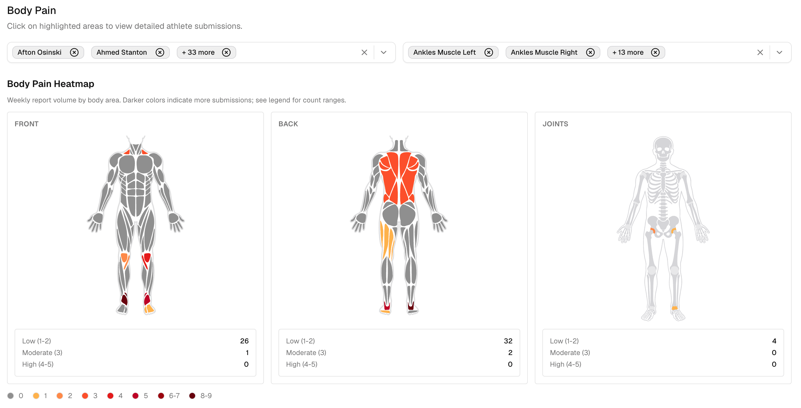
Fractall coach dashboard showing a squad body pain heatmap with affected regions shaded by how many athletes reported them

Start here

Quick answer

Checked live on 1 September 2026. Vendor features move, so re-check anything that decides a purchase.

All seven athlete monitoring tools we checked let an athlete report pain by body area, so the presence of a map isn't what separates them. Fractall, TeamBuildr, XPS Network, Teamworks AMS, CoachMePlus and Lumin Sports all have one. AthleteMonitoring captures a painful area and a level out of 10, though nowhere on its wellness marketing page does it say so. Kitman Labs and UltraX AI don't publicly document one.
What separates them is what happens after an athlete taps the map. Almost every vendor page stops at “athletes mark where it hurts”, and leaves the coach to find out later whether left and right are separate fields, whether a three held for a week raises anything, and whether that history is still there when a physio opens an injury record.

How to read this comparison

Every cell below traces to a vendor page or support article we read on 1 September 2026. Where a vendor is silent, the cell says “not documented” rather than “no”. A no is a factual claim about somebody else's product, and we're not making one on the strength of a page that simply didn't mention it.

The criteria

Eight questions no vendor page answers

Take these into a demo. They separate a body map that changes a session from one that produces a picture.

A body pain mapping tool earns its place when it captures where, which side, what kind of tissue and how bad, then does something with that beyond storing it. These eight questions test for that. Most product pages answer two of them.

Ask the sales engineer, not the marketing page

  • Is the input an anatomical map, a region picker, or just one soreness number?
  • What is the intensity scale, and are the points labelled or bare numbers?
  • Are left and right separate fields, or one region?
  • Is tissue type captured, so a knee joint is distinguishable from a quad?
  • Do I get a squad-level view, or only one athlete's history at a time?
  • Does a flag weigh how long something has persisted, or only today's number?
  • When a physio opens an injury record, is the preceding week of pain reports already attached?
  • Can the athlete add a sentence, or only tap a shape?
Questions three, four, six and seven are where the field thins out. They're also the ones a demo won't volunteer, because they're the difference between collecting pain data and using it. If you're earlier than this and still choosing a wellness platform at all, start with our comparison of athlete wellness monitoring tools and come back to this page once you've shortlisted.

Side by side

What the athlete actually reports

The input decides everything downstream. You can't aggregate a field nobody collected.

One of the seven captures tissue type as a separate field. The rest sit somewhere between an anatomical diagram and a painful-area field attached to a wellness questionnaire, and most don't publish enough detail to tell which.
ToolHow the athlete reports painIntensity scale
FractallAnatomical map, front and back. Region, left or right, tissue type (muscle, joint, bone or skin) and a free-text note per area.1 to 5, labelled from minor discomfort to extreme pain
TeamBuildr (Body Heat Map)Athletes select body areas and rate the discomfort.Documented as a scale. Range not published.
XPS Network (Body Chart)Marks muscle soreness on a body diagram, sent as its own form or attached to an existing readiness form.Not documented
Teamworks AMS (formerly Smartabase)Pain and stiffness reported inside the wellness questionnaire. Mobile entry includes body diagrams.Level of pain out of 10
CoachMePlusBody chart is one question type in the wellness questionnaire, recording muscle and joint soreness.Not documented for the chart itself
AthleteMonitoringPain and stiffness reported inside the wellness questionnaire. Input type not documented.Level of pain out of 10
Lumin SportsBody map for marking soreness location. The wellbeing check-in also carries a general soreness score for the whole athlete.0 to 10 for general soreness
Two things stand out. The first is how rarely laterality and tissue type appear anywhere in public documentation, even though both change what a coach does: a left adductor reported three days running is a different conversation from “groin”. The second is AthleteMonitoring, where the feature is real but effectively undiscoverable. Its wellness page lists sleep, stress, fatigue, mood, soreness and HRV and never mentions pain location. The support documentation describes the pain and stiffness tracker in detail.
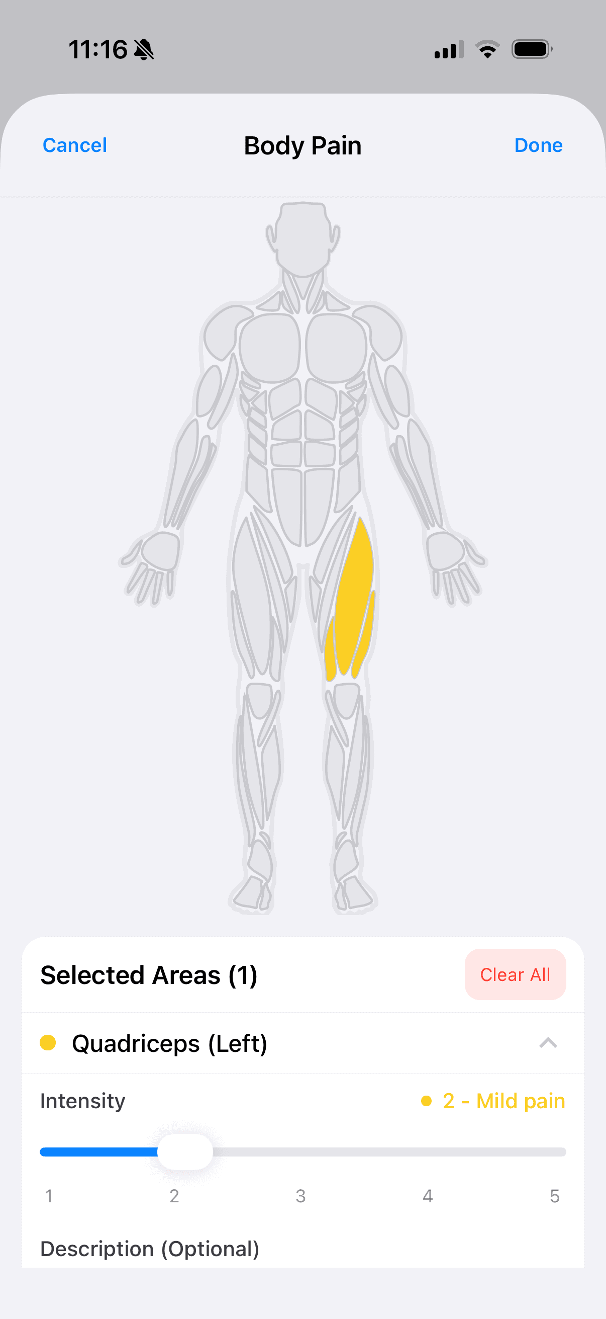
Fractall mobile body pain map showing front and back anatomical views with selectable muscle and joint regions
The athlete side in Fractall: front and back views, muscle and joint layers, one tap per area, then intensity and an optional note.
Fractall row read from the product source on 1 September 2026. TeamBuildr row from its Body Heat Map page. XPS Network row from Sideline Sports' Body Chart release post, dated 28 September 2023. Teamworks AMS and AthleteMonitoring rows from their pain and stiffness documentation. CoachMePlus rows from its subjective internal load and athlete questionnaire pages. Lumin Sports wellbeing scores and flagging logic from its wellbeing monitoring help article, and its OSIICS injury classification from its injury tracking article.

Side by side

What the coach gets back

Collection is the easy half. The question is whether anything reaches you before Tuesday's session.

Every tool here shows a coach the pain an individual reported. What varies is whether you get a squad-level view, whether anything fires on its own, and what that flag is measured against.
ToolWhat the coach getsWhat we could not verify
FractallSquad heatmap by region, side and tissue type, with report count, athletes affected, and average and maximum intensity. Flags weigh persistence across seven days, not only today. Pain history attaches to a new injury record.Nothing. This one we read in the product source rather than on a marketing page.
TeamBuildr (Body Heat Map)A heat map coaches use to guide recovery decisions and training adjustments, inside the AMS package.Squad aggregation method, flag rules, left and right, tissue type
XPS Network (Body Chart)A Body Chart monitoring report, colour-coded markers in injury management, and notifications routed to whichever coaches you choose when an athlete files one.Squad aggregation, intensity scale, left and right
Teamworks AMS (formerly Smartabase)The painful area and the level display automatically alongside the wellness questionnaire, inside a platform built around medical records.Region granularity, left and right, tissue type
CoachMePlusData lands in the athlete dashboards, and they make the case for comparing marked regions against the training programme to look for cause and effect.Squad aggregation, flag rules, intensity
AthleteMonitoringA pain and stiffness widget on the readiness dashboard showing area and level for today and the previous seven days.Whether the athlete draws on a diagram or picks from a list
Lumin SportsFlags compare today against that athlete's own seven-day average and standard deviation, so they fire only outside their normal range. Injuries are classified separately with OSIICS.Intensity scale on the map, left and right, tissue type
XPS Network's notification routing is the quietly useful design here: you pick which staff get told when a body chart comes in, which is the difference between a physio seeing it and a form filling up a database. Lumin has arguably the smartest flagging logic of the seven, because it compares an athlete against their own baseline rather than a fixed number.

7 of 7

Tools that capture pain by body area

The map itself is table stakes. What comes back from it is not, which is what the two tables above are for.

1 of 7

Capture tissue type as its own field

Muscle, joint, bone or skin as a separate field on the pain report. Others may capture it without saying so.

Before you buy

What a body map can and cannot tell you

The honest position, and the vendor who states it best is not us.

Body pain map

An anatomical diagram inside the daily wellness check-in where an athlete marks where it hurts, instead of only rating overall soreness as a number.

Example: An athlete taps the left hamstring, sets intensity to 3, and adds 'tight since the finishing drill'. The coach sees a location, a severity and a cause to check, rather than a soreness score of 6.

CoachMePlus, who sell this feature, put it plainly on their own site: “The scientific support for body charts is currently unknown”, and “no specific claims have been made as to their effectiveness for performance and injury prevention.” That's a competitor conceding the point, and it's the right call. Treat any page promising a map prevents injuries with the scepticism it earns.
The research supports something narrower and more useful. In 167 athletes with longstanding groin pain, digital pain drawings matched the anatomy of each clinical entity, but the distributions overlapped enough to limit classification of an individual, and pain quality didn't differ between entities at all. A map localises and communicates. It doesn't diagnose, and no coach should be using it to.
Tissue type earns its place as a field for a concrete reason. In 24 junior goalkeepers recording pain daily across a five-day camp, the area covered differed significantly between muscle pain, joint pain and impact pain. Thighs dominated muscle pain, reported by 21 of the 24. Joint pain concentrated in the groin and hip. Impact pain sat in the hips, shoulders and forearms. Collapse those into one “pain” field and you lose the distinction between a training-load problem and someone who keeps landing on their shoulder.

One caveat worth keeping

In 14 Japanese national-team handball players, pain in the dominant elbow negatively predicted concentration, but no significant effect of body pain on objective performance was found. Small sample, four days, elite athletes only. It cuts both ways: pain tracks how an athlete feels and reports, which is exactly why you have to ask rather than infer it from GPS, and also why a pain report is not by itself proof that output has dropped.
Groin study: Digital body mapping of pain quality and distribution in athletes with longstanding groin pain, Scientific Reports, 2022, n=167. Goalkeeper study: Practical Use of the Navigate Pain Application for the Assessment of the Area, Location, and Frequency of the Pain Location in Young Soccer Goalkeepers, Journal of Human Kinetics, 2019, n=24. Handball study: Body Part Pain Affects Subjective and Objective Handball Performance in Japanese Male National Athletes, Sports (Basel), 2024, n=14. All three are small or clinic-recruited samples and none of them tested a coaching intervention.

Honest assessment

Where the other tools are ahead

We sell one of these. Here is where the others beat it, and who shouldn't buy ours.

Lumin Sports: better flagging logic

Lumin does one thing here better than we do. It flags against each athlete's own seven-day average and standard deviation, so a stoic player who never reports above a 2 still triggers something when they move. Fractall's pain flags use fixed intensity bands weighted by persistence, which is simpler to explain and blind to that athlete. If your squad is small enough that you know everyone's baseline in your head, that gap is academic. If it isn't, it matters.

Teamworks AMS and Kitman Labs: medical depth

If you employ a medical team that needs a genuine health record, with clinical workflows and governance around who sees what, an enterprise platform is the right home for pain data and we are not. Fractall is built for the coach making a decision about Tuesday, not for a medical department managing liability.

TeamBuildr: the incumbent advantage

If your programme already runs inside TeamBuildr and staff live in its programme builder, its Body Heat Map is right there. Adding a second platform for pain mapping alone would be a bad trade, and no feature table changes that.

CoachMePlus: intellectual honesty

They state the evidence limitation on their own product page. Most vendors in this category, ours included until this guide, let the reader assume more than the research supports.
When Fractall isn't the pick: you need a full medical record rather than a coaching tool, you have hardware and integration requirements that a file-import model won't satisfy, or your organisation runs procurement through a platform you've already standardised on.

In the product

How body pain mapping works in Fractall

Part of the daily wellness check-in, not a separate form the athlete has to remember.

The athlete opens the same daily check-in they already use for sleep, soreness, stress, mood and fatigue, taps Body Pain, and marks the area on a front or back view. Each mark carries the region, the side, the tissue type and an intensity from 1 to 5 with named steps rather than bare numbers, plus an optional sentence. It saves inside the same submission as the wellness scores, so there's one form and one habit to maintain. Compliance is the thing that kills subjective monitoring, and we wrote separately about keeping athletes filling it in.

What happens on the coach side

1

The Wellness tab shows a squad heatmap aggregated by region, side and tissue type, with how many reports and how many different athletes sit behind each area, plus average and maximum intensity.

2

Concern flags weigh persistence rather than today's number alone. A single moderate report raises nothing; the same moderate report held across most of a week does.

3

Open an injury record and the pain that athlete reported in that region over the previous seven days is already attached, with report count and average and maximum intensity.
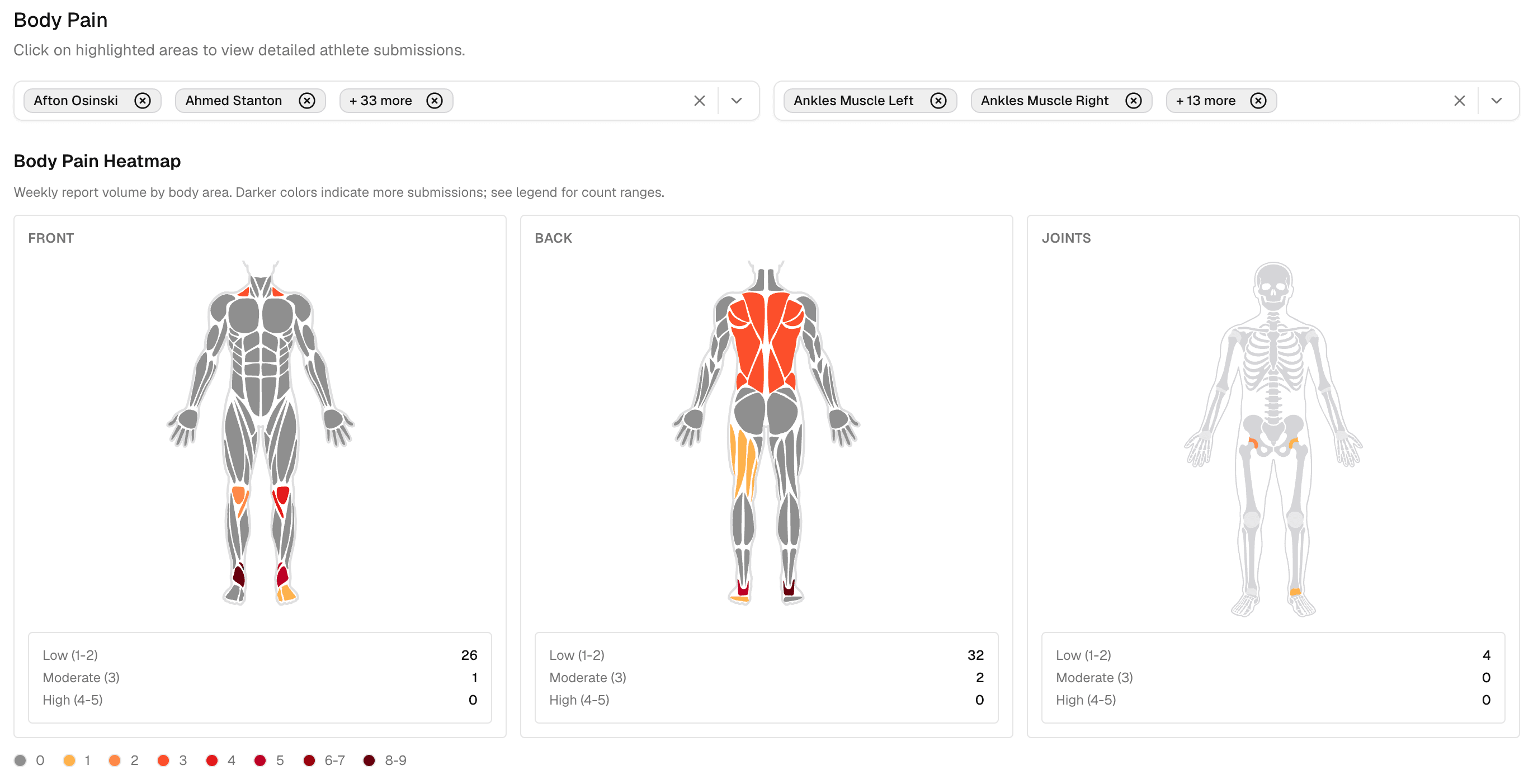
Fractall wellness body pain analysis showing aggregated squad pain areas with intensity and report counts
The squad view. The same region lighting up across several athletes points at the session rather than the athlete.
The last step is the one that pays off months later. A pain mark that turns into an injury stops being a data point and becomes the record of what the athlete told you first. There's more on that side of it in our guide to what to record when a player gets injured, and the full feature sits under wellness tracking alongside the McLean scale and the cycle tracker. Clubs running the whole picture usually pair it with football athlete monitoring.

See where your squad actually hurts

Region, side, tissue type and intensity in one tap, aggregated across the squad and attached to the injury record when you need it. €20 per team per month, no hardware, free for 4 weeks.

Start free trial

FAQs

Frequently asked questions

What coaches ask when they start comparing pain mapping tools.

What is a body pain map in athlete monitoring?

A body pain map is an anatomical diagram inside the daily wellness check-in where an athlete marks the area that hurts, rather than only rating overall soreness as a number. Better implementations also capture which side, what kind of tissue, and how intense it is, so the coach gets a location instead of a score.

Do body pain maps prevent injuries?

No published evidence supports that claim, and CoachMePlus, who sell one, state plainly that the scientific support for body charts is currently unknown and that no specific claims have been made about their effectiveness for performance and injury prevention. What a map reliably does is tell you where to ask a question and give you a record of what an athlete reported before a problem became an injury.

Which athlete monitoring tools have a body map?

All seven tools we checked on 1 September 2026 let an athlete report pain by body area: Fractall, TeamBuildr, XPS Network, CoachMePlus, Teamworks AMS, AthleteMonitoring and Lumin Sports. Lumin pairs its map with a general soreness score from 0 to 10. Kitman Labs and UltraX AI do not publicly document a body map. Vendor documentation in this category is patchy, so confirm the details that decide a purchase in a demo rather than from a features page.

Is a body map better than a single soreness score?

For deciding what to change in a session, yes, because a score of 7 tells you nothing about whether it is a hamstring or a shoulder. For spotting an athlete drifting away from their own normal, no: a single tracked number handles that well, which is why Lumin flags against each athlete's own 7-day average and standard deviation. The two answer different questions and the strongest setups collect both.

What should a coach look for when comparing body pain tools?

Whether the input is an anatomical map or just a region picker, whether the intensity scale is labelled, whether left and right are separated, whether tissue type is captured, whether you get a squad-level view rather than only per-athlete history, whether flags weigh persistence or only today's number, and whether the pain history attaches to an injury record when you open one.

Related guides